Reviewing Results
After running the optimiser, the Optimisation tab updates to show the resulting assignments. A calendar view displays all tasks with their assigned persons, colour-coded by task type.
Optimised Calendar
The optimised calendar shows each task with its time slot, location, and the persons the solver has assigned. For floating tasks, the solver-chosen time is displayed in place of the original time range.
Metrics Board
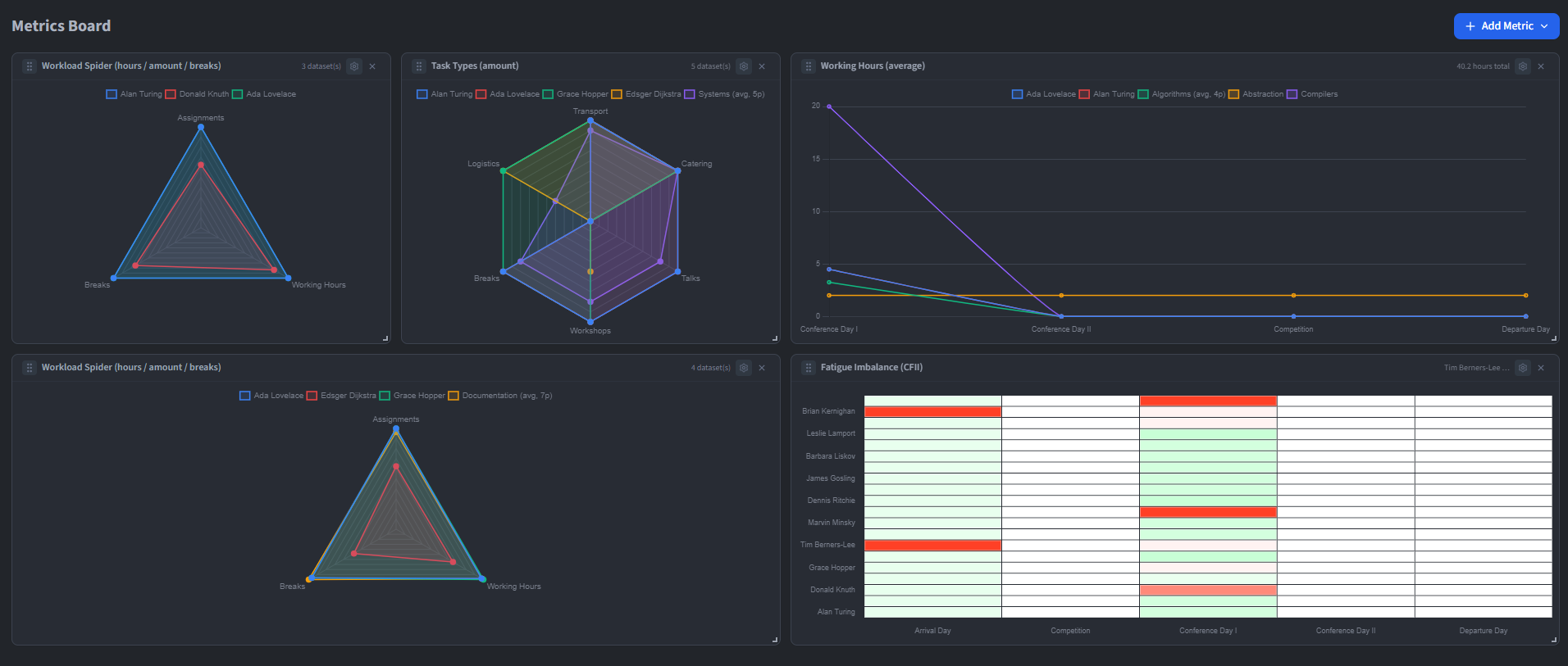
Click View Metrics to open the metrics dashboard in a separate window. The board shows a configurable grid of metric cards that can be added, removed, resized and reordered by dragging. The layout is saved between sessions.
Available metrics include:
- Average Working Hours - Mean hours assigned per person.
- Absolute Working Hours - Total hours per person shown as a chart.
- Workload Spider - Radar chart comparing workload distribution across persons.
- Fairness - How evenly hours are spread across the team.
- Task Type Count Spider - Radar chart of task type distribution per person.
- Task Type Hours Spider - Radar chart of hours per task type per person.
- Fatigue Timeline - Line chart tracking fatigue over the event.
- Max Work Streak - Longest consecutive working period per person.
- CFII - Continuous Fatigue Index Indicator.
Each card can be toggled between per-day and whole-event aggregation, and filtered to specific persons using the resource selector. Changes to the optimisation are reflected in the metrics in real time as a dashed preview overlay.